
Something occurred to me this morning when I saw this:
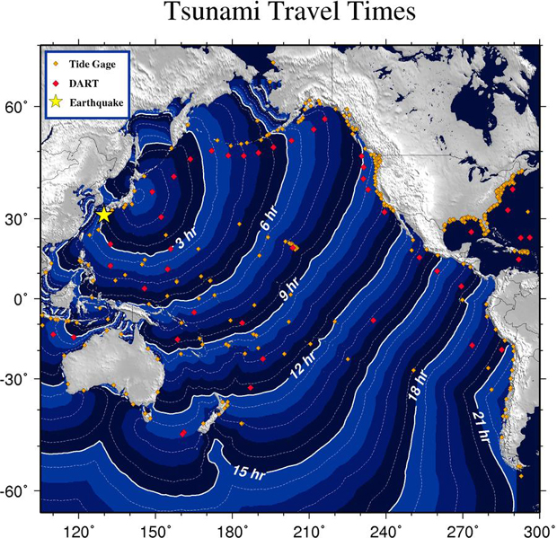 (source)
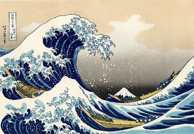
…And it was this:
 (source)
Do you think it’s a coincidence that NOAA’s mapmaker chose that particular royal blue / sky blue / white color scheme, augmented by gray continents with yellow accents? I suspect it’s a beautiful shout-out to the classic piece of tsunami art. The reality is that tsunami are often a horrid brown gray color, full of entrained debris and suspended sediment. The blues in these maps don’t capture the reality of tsunami in nature. Art may imitate art, but it’s not imitating life in this case!
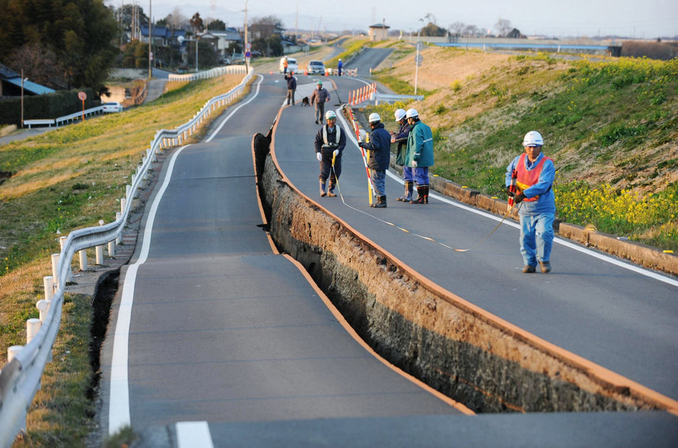
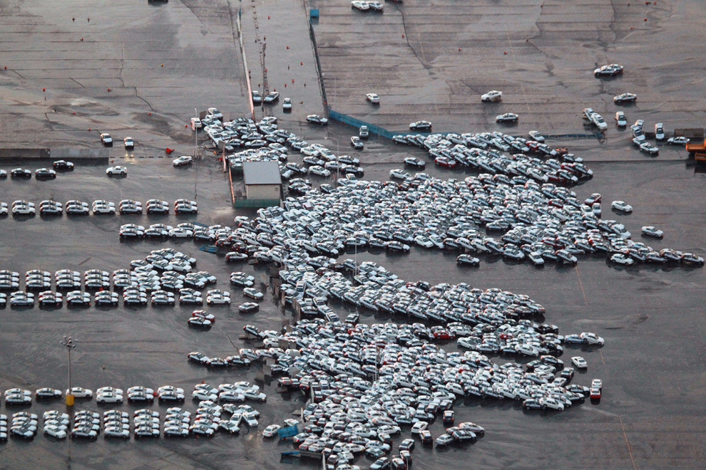
We are seeing some profound destruction today, but while it thoughtlessly slaughters us, the Earth also generates some beautiful patterns… (Links go to a select cut among the many striking images hosted at the Boston Globe’s “Big Picture” site.) What a strange, scary, beautiful planet we live on.
The classic art is probably a major contributor to the myth that tsunami look like plunging breakers. Last term my students had a heated debate about if the art was more likely a tribute to huge waves during storm surge, freak/rogue waves, or tsunami.
Mika, That is a GREAT point. I was chagrined anew this morning to hear the media discussing the tsunami as it arrived in Hawaii as if they were expecting a giant, curling breaker like the ones they get on the North Shore…
We should commission some artist to remake the classic image to look like a real tsunami, as a way of getting that message out.
Very good Callan! This work hangs on our lab wall. Art is full of hydraulic and geomorphologic incorrectness, hence http://lrrd.blogspot.com/search?q=incorrect . But is this painted wave supposed to be a tsunami?
It’s a good question; ask Mika’s students.
The class conclusion was freak/rogue wave because of the extreme steepness & impressive height relative to the surrounding waves.
As an ex Coast Guardsman, I say pure artistic license, he’s stylized the waves, boats, and added some nice wind spray off the tops :-).
And I keep meaning to say your blog banner really rocks, who put that together?
I put together the original, but then AGU hired some artist to rework it for the AGU Blogosphere. I liked my version better. Wah.
It’s very, very good, still, only thing I’d change is the font.
Hey- I just noticed (well, one of the Skepchick readers noticed) that the earthquake star is in the wrong place on the NOAA map.
Yep, they’ve fixed it: http://wcatwc.arh.noaa.gov/2011/03/11/lhvpd9/34/ttvulhvpd9-34.jpg