
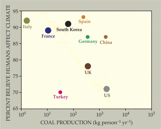
I read an article in the current issue of Physics Today with interest. It deals with the nature of scientific controversies, as percieved by the public and by specialists in the field in question. The author, Steven Sherwood, compares the origin of the ideas of a heliocentric solar system, general relativity, and human influence on the Earth’s climate. Each of them follows a similar pattern, he argues, with the initial idea leading to increasing levels of expert consensus, organized public backlash, and then a growing public consensus. It’s worth a read. But this post is just to comment on one of the graphs included in the article, Figure 3:

(source)
Basically, the point here is that the more coal your country produces, the less likely your populace is to accept the notion that burning that coal causes changes in the Earth’s climate. So if you were to fit a trend to these data, that line would have a negative slope.
It reminded me of a widely-cited survey from 2005 on different countries’ acceptance of evolution. On a whim, I decided to compare the acceptance-of-evolution data with the acceptance-of-anthropogenic-climate-change data. But the two datasets were not identical (they included different countries), so I excised the countries in the climate-change dataset for which I didn’t have evolution data. Say goodbye to Mexico, Brazil, Canada, and Australia:
(modified from source)
The trend loses some “oomph” once those four countries’ data are excised, eh?
Then I eyeballed the coal production values, and added them to a spreadsheet I had already developed with the evolution values. And I plotted it, again, keeping coal production as the constant variable:
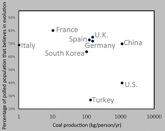
Not as clear a trend.
I wouldn’t expect coal production to necessarily correlate with rejection of evolution – my hypothesis was simply that anti-science viewpoints in different countries might correlate broadly. I was wondering if the evolution vs. coal graph would have the same pattern as the climate change vs. coal graph. It doesn’t, really, though there are some similarities: The U.S. and Turkey are near the bottom of each plot, and industrialized European countries + Asian countries are near the top. But I’m not sure I really learned anything new in this graphing exercise.
Oh well: it was fun to do. Maybe the more interesting plot would be rejection of climate change vs. rejection of evolution…
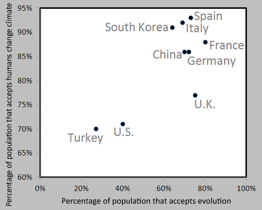
Yes, that gets closer to the relationship I was looking to explore – Italy, Spain, and South Korea show similar levels of climate change consensus as the expert climatologist community. The U.S. and Turkey are the most extreme outliers in this group of nations. However, you should note the difference in the horizontal percentage scale and the vertical one. Overall, the human influence on climate change is much more widely accepted than evolution. This becomes evident if you plot them both on the same scale (with 0% as the minimum axis value):
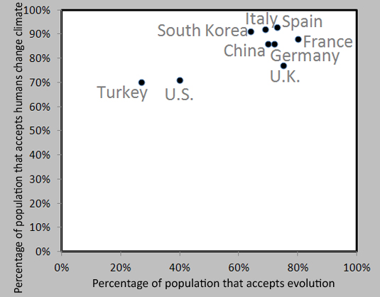
All the variation in climate change opinion takes place between 70% acceptance and 93% acceptance. Plotting the data on an axis that runs from 0% to 100% results in a lot of empty space at the bottom of the graph. Variation in evolution opinion, on the other hand, spans a wider range: 27% to 80%. It’s more diverse, but for all nations, there is still a lot of room at the top – the far right side of the graph. No nation shows more than 80% acceptance of evolution – an astonishing statistic in my mind. Call it the “glass ceiling of scriptural literalism” – reason cannot rise any higher given the current cultural mores.
Of course, the big story (if any) from this display of data is that both the polled public of the United States and Turkey are not as keen as peer nations on these two particular scientific insights. Both also have strong religious traditions: Christianity in the US, Islam in Turkey. Is that sufficient explanation? Perhaps, or perhaps there’s more to it than that.
But I’m done with my graphical dalliance, so that’s all I’ll analyze this issue for the day. Any thoughts?
Interesting comparison. I wonder if using “per capita” coal production is really the right approach here. It’s difficult to compare countries like Canada and Australia with China when normalizing population. I suppose it might provide a very rough way to approximate the economic importance of coal mining in the national economy for each country but it still seems odd. Might be better to look at either global rank or fraction of national GDP.
Actually I started to download and process the data in order to do that but soon realized I was in danger of loosing my Sunday evening to it. It is interesting also that they did not include a few countries for which data on both coal and climate change attitudes is available (Indonesia, India, Russia) and which more or less reinforces their point. In fact, India is really remarkable: the # 3 global coal producer after China and the US, only 47 (!) percent of Indians agree that “human activity IS a significant cause of climate change”. Due to the massive population of India however, it sinks way down on the list when you calculate coal production per capita.
It is also interesting that English speaking countries seem to plot as a separate population of data points, and that respondents from these countries identified themselves as especially well-informed on the issue (which is what is shown by the differing circle sizes in the first graph). This might be suggesting something very interesting about the nature of the “debate” in the English speaking world relative to other regions.
I realize none of these observations actually pertain to the connection between opinions about evolution that you highlight … I haven’t quite yet had the time to dig into that data enough to formulate an opinion on that.
Neil beat me to the point I was going to end up with — the dummy variable “English vs non-English speaking” looks far more significant than coal output, predicting acceptance of GW. I would guess that the r-squared of the first graph would be nowhere near significant, even if you threw out Australia and Turkey.
For example, England/Canada/US have roughly equivalent coal production as Spain/Germany/China but the average acceptance is very different.
There is a vigorous “debate” about CO2 in English. I wonder whether anyone has taken up the non-scientifically based side of things in other languages…
(No comments made by this poster should be construed, in anyway, to suggest that global warming is either (a) not happening or (b) driven primarily by activities other than those of humans. Alas, Global Warming is happening and is driven by carbon emissions.)
It is easy, Ezra: Here over Europe we just accept what is a fact, and we don’t make controversies over it:
http://www.youtube.com/watch?v=9QBv2CFTSWU
Only 40% of the US population accepts evolution? Yikes.
Yeah…. (grimaces)
Well the 40% figure represents those that answer “true” to the following statement: “Human beings, as we know them, developed from earlier species of animals.” Another 20% of the US answers “not sure.” But that ~50% number has been more or less static for the 30 years or so that polls have been conducted. Strangely, level of education and attitudes about the promise of science and technology show no correlation in the US although they do elsewhere. Political persuasion shows a strong correlation in the US, but not in Europe. Religious belief is the strongest correlate everywhere.
When you actually describe the process of natural selection without using the hot button words “evolution” or “humans” you can actually get something like 80% agreement. This is at first encouraging because it suggests there is prospect to make some ground here, but I fear there is a willful and entrenched resistance to human evolution in particular that does not seem to be all that shaken even when people become better educated about the facts.