This image has been in my “to blog” folder for more than a year:

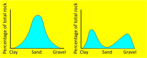
But here’s the thing – I can’t think of what I was going for when I drew this. The closest I can figure is that I was trying to illustrate conceptually what differentiates diamictites from other poorly sorted sedimentary rocks. Any other ideas what I might have been thinking?
Notice how small it is (only 468 pixels wide) — clearly intended for the skinny columns of the WordPress version of this blog (which has been mothballed since I moved to the AGU servers more than a year ago). Sometime, eighteen months ago, I took the time to generate this image – it bugs me that I can’t recall what my point was.
I’m going to delete it from the “to blog” folder as an (unidentified) idea past its prime…

I too have no idea what you were trying to illustrate, but it seems like you may have hit upon a theme for an entire new blog. People post figures and graphs from their past, searching for help from the masses to understand their past thought process. I know personally I have any number of figures that I took the time to painstakingly craft, but now, for the life of me, can’t remember why… Maybe illustrator and beer/wine don’t mix as well as previously suggested?
Two species of camels: Dromedary (arabian -single hump) and Bactrian (central asian-double hump).
Maybe you were going to discuss the meaning of “bimodality” in sediments, which is a pretty important concept (for your students?). The graph on the left suggests a single-input sediment (mostly sand with a normal “bell curve” population distribution that includes a minority of finer and coarser grains). The graph on the right suggests two inputs: for example, a hydraulically sorted shoreface/beach sediment (coarse sand/granules) with a secondary input of aeolian silt blown in from back-beach dunes. (?)
The only idea I could come up with is that this is good reason/example to show why one must note ideas as a whole and to be sure of what one postulates before sequestering said data from any group of peers eyes until said information is lost to the contextual reasoning it was initially intended towards
If I need to write a story about this graph then I would say that these graphs illustrate the ease of transport of different sized particles. Sand is the easiest to erode but it takes significantly stronger flow to move gravel and consolidated clay. That explains why there are peaks in gravel and clay (sand is carried away). The graph on the left is the initial situation (sand is the most abundant component).
I can sympathize, having found a few of these “buried treasures” in long-lost drive folders. Given the distinct bimodality and peaks in the clay and gravel range, I would agree with your notion that you had intended to contrast diamictites (or possibly tillites, in general) with either (a) a well-sorted sand (the figure on the left), or (b) other bimodal distributions (i.e.: of the coarse – very fine-grained eolian variety).