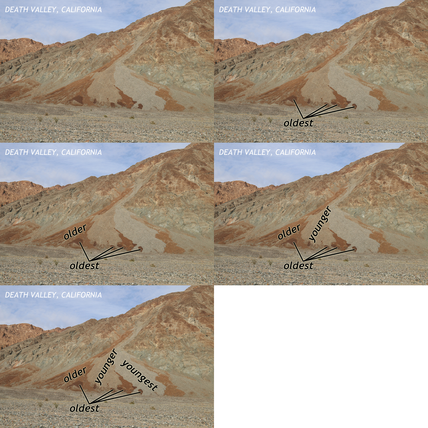
Working up some new images for my free, online Historical Geology textbook, I annotated a photograph I took in March of this alluvial fan in southern Death Valley. The development of desert varnish on older parts of the fan shows their age visually in a quick and easy way of determining fan deposit sequence:

I’ve been making a lot of these animated annotations as a way of conserving space in the “real estate” of the online text’s pages.
Happy Friday. Back to folds next week!

The animations are a good way not only of conserving space, but showing the strengths rather than the weaknesses of an online text vs a paper one, IMO. Trying to approach online teaching with this mindset 🙂
Agreed that it saves space, but in this case I would like the non-annotated image followed by the second version with annotation. While the future of teaching is increasingly online, not including impositions by CV-19, I think that the ability to selectively add annotations (e.g., PPT) to an initially unmodified photo is more powerful. Seeing and understanding are sequential steps, with the teacher establishing the time interval between those two. Just my muddled thoughts.
It reminds me of the weathering of lava flows in Hawaii.